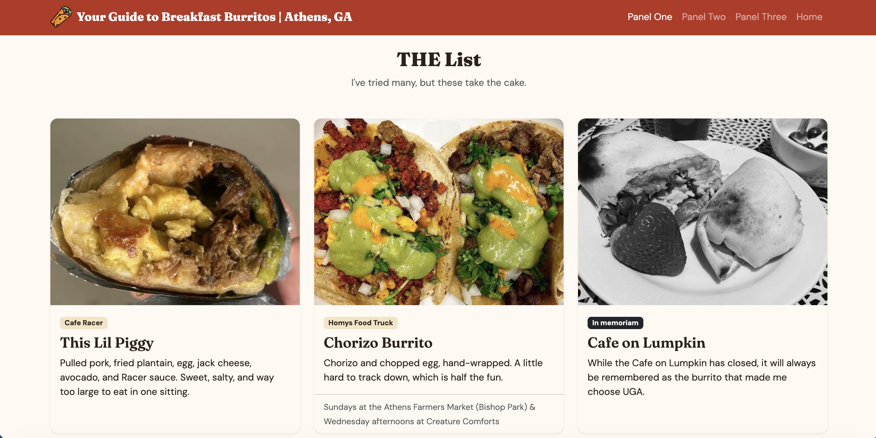
Panel One
Panel One is the longest page I’ve ever coded. It took me a while to get the layout working, and finishing it is what I’m proudest of. I built a Bootstrap navbar with my own burrito logo and links to every panel, a button, and a grid of cards that stacks on phones and spreads out three across on desktop. I used custom.css to pick a red, cream and gold palette that I think goes well together, and I added a hover effect so the cards pop up off the page. I also added accordions that explain why I picked each burrito. My favorite part is the content itself. I love how it captures not only my favorite food, but why they have a special place in my heart.
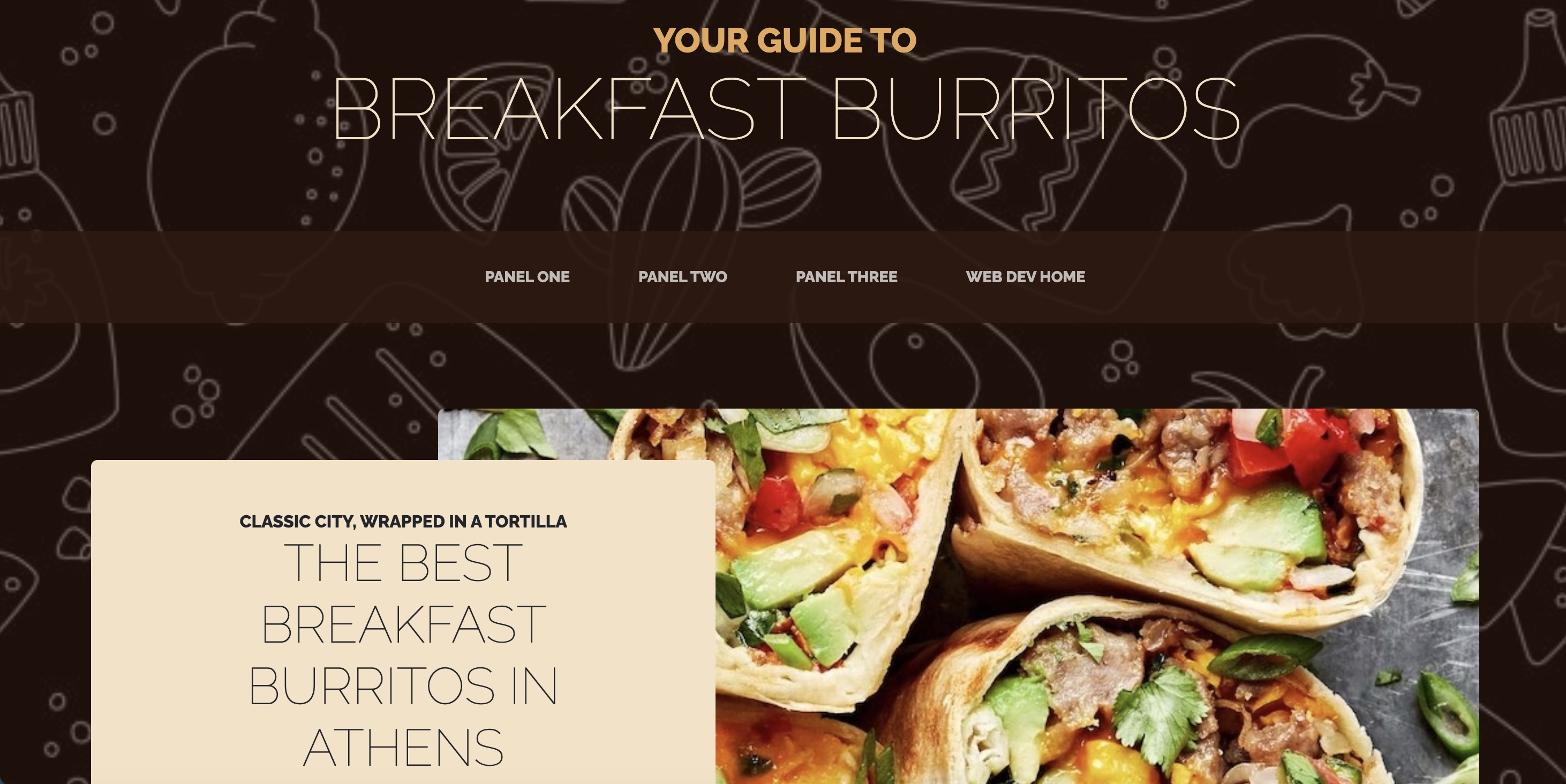
Panel Two
The part of Panel Two I’m proudest of is changing the background without any CSS. Our class site made it sound hard, so figuring out how to swap the theme’s background image felt like a win. Finding a theme was harder than I expected, because Bootstrap has fewer than I thought. I picked one that fit the food vibe I wanted, even though its colors were not what I would have chosen. It took me a while to size my images evenly, and moving all of my content from my own page into the template was tedious, but I got it done. What I learned is that a template saves time up front but limits how much you can change. I can see now why custom CSS matters, which made me more ready for Panel Three.
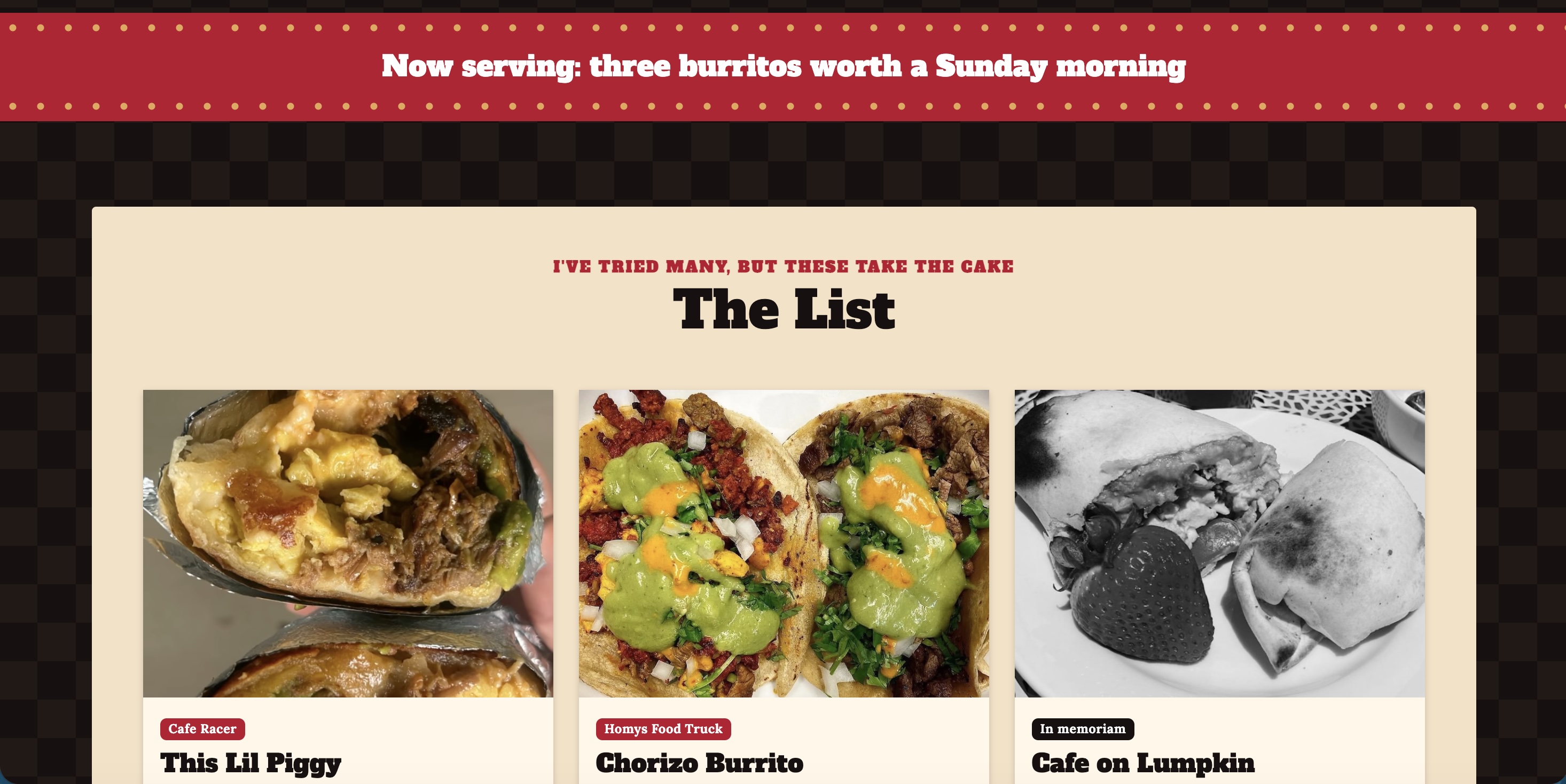
Panel Three
Panel Three is the one I’m most proud of, because it’s where I could finally change the theme with CSS. I replaced a blurry background with a clean checkerboard pattern, chose a red, cream and grey color-way, and used red accents throughout, including an underline on the current page in the navbar. I added shadows and a hover effect so the cards and photos pop off the page, and I kept the hover effect I liked from Panel One. I also added a red banner under the intro to give the page more personality. In the future, I want to learn how to use JavaScript more effectively and integrate that into my future sites.